Ensure a consistent look and feel across all channels while maintaining their unique identities.
Design intuitive navigation and interactions to make content easily accessible.
Create a responsive design that performs well on various devices, ensuring an optimal user experience on both desktop and mobile.
Develop a visually appealing interface that enhances user engagement and reflects the brand's modern identity.
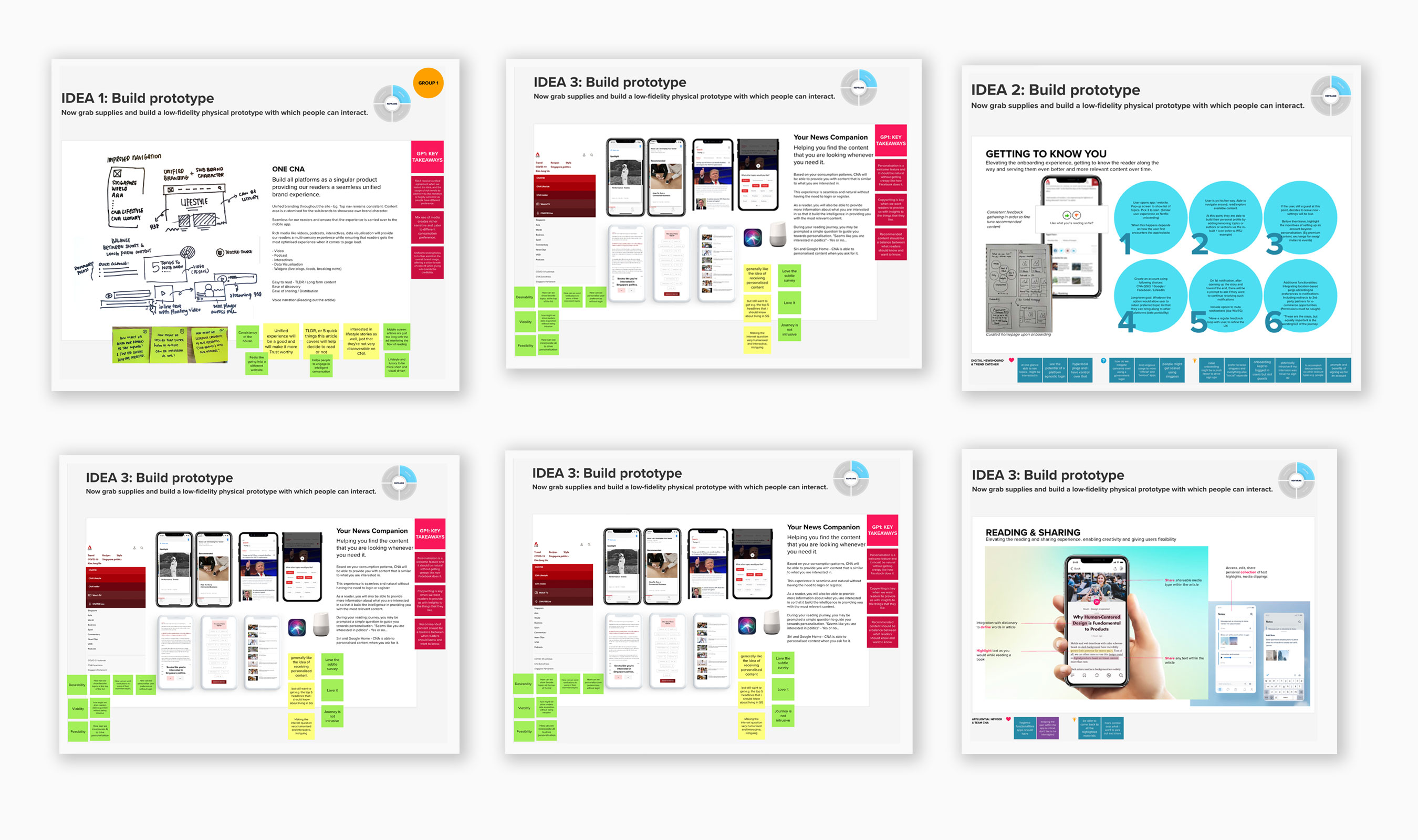
After the initial brainstorming, we separated into breakout groups to develop and refine ideas. We analysed user experiences on existing and competitor platforms, envisioned an ideal user journey, and identified key features. Chosen ideas were developed into prototype visuals, while additional ideas were documented in a "quick wins/other ideas" list to ensure nothing was overlooked.
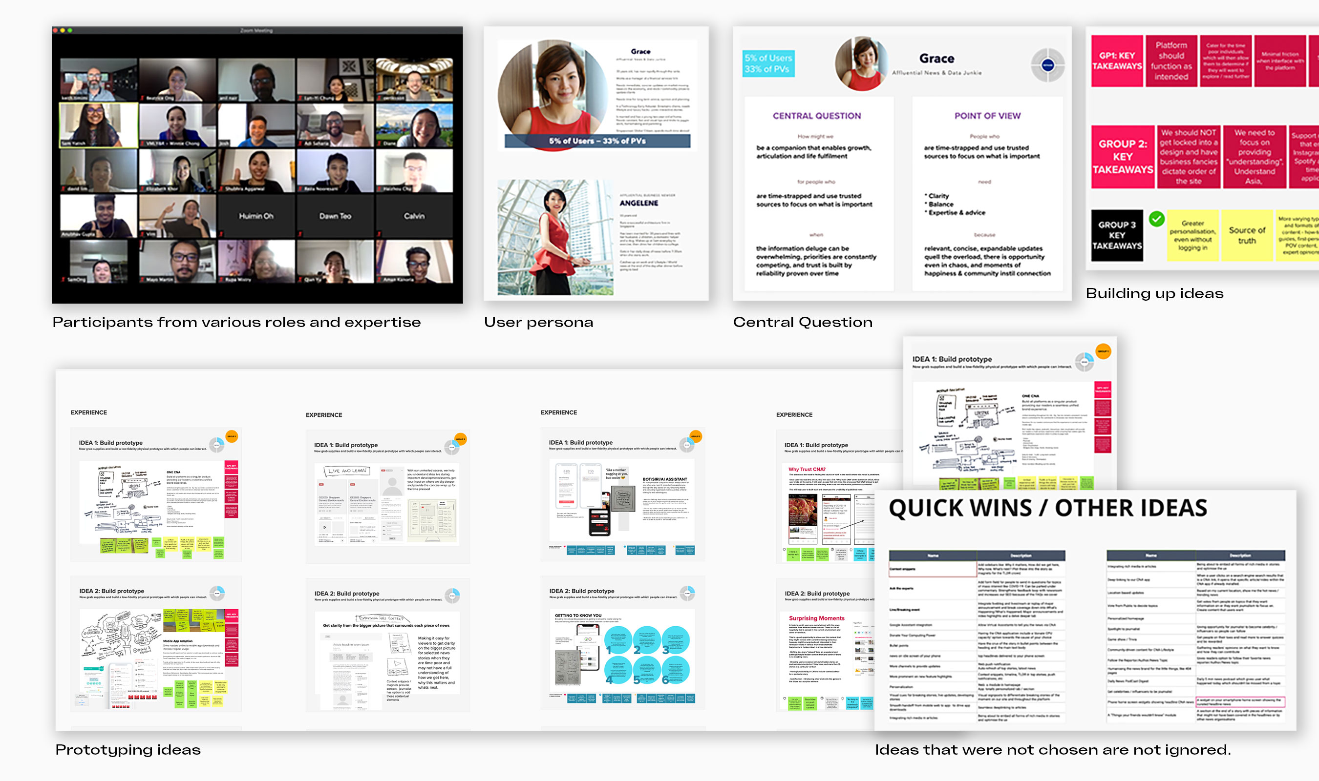
Ideas included personalisation through geotagging, personalised news feeds, and an AI virtual assistant for continuous engagement. To enhance user engagement, we suggested integrating elements of surprise, morning briefings, and push notifications.
User interaction improvements included dictionary integration and a community view layering expert opinions and feedback loops. For information delivery, we proposed real-time insights and concise summaries. Ultimately, we aimed to create a seamless ecosystem with consistent personalisation and a unified brand experience across all platforms.
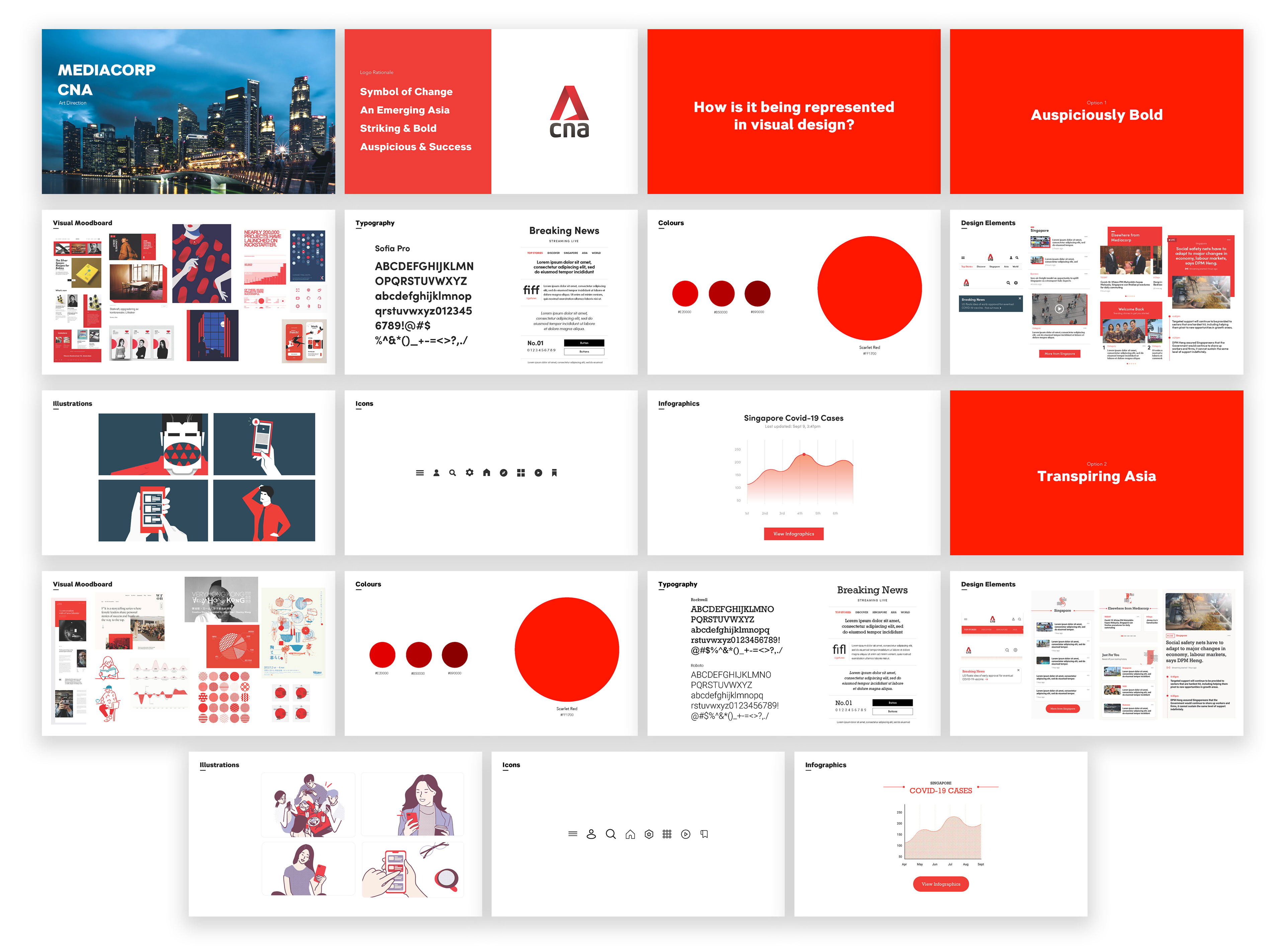
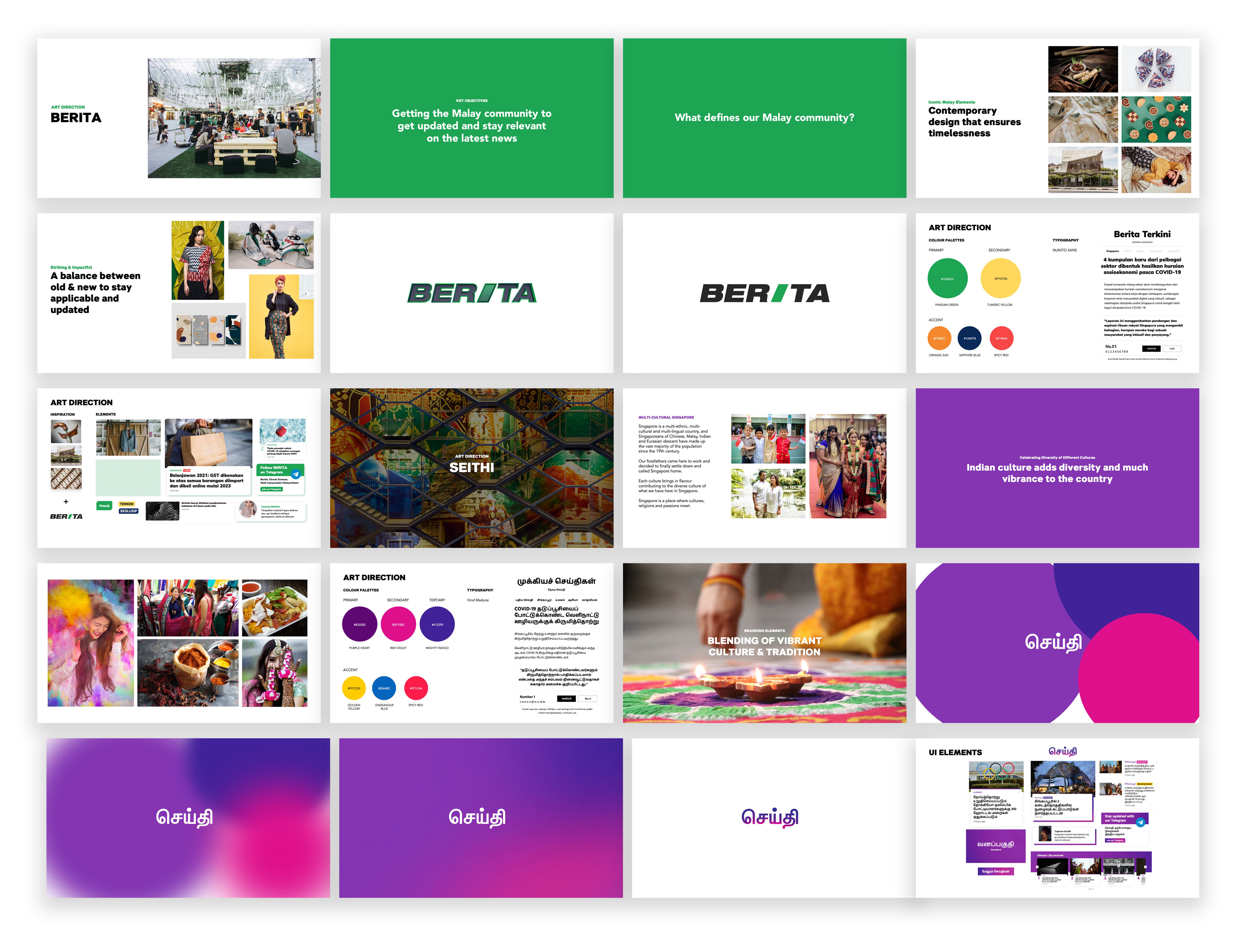
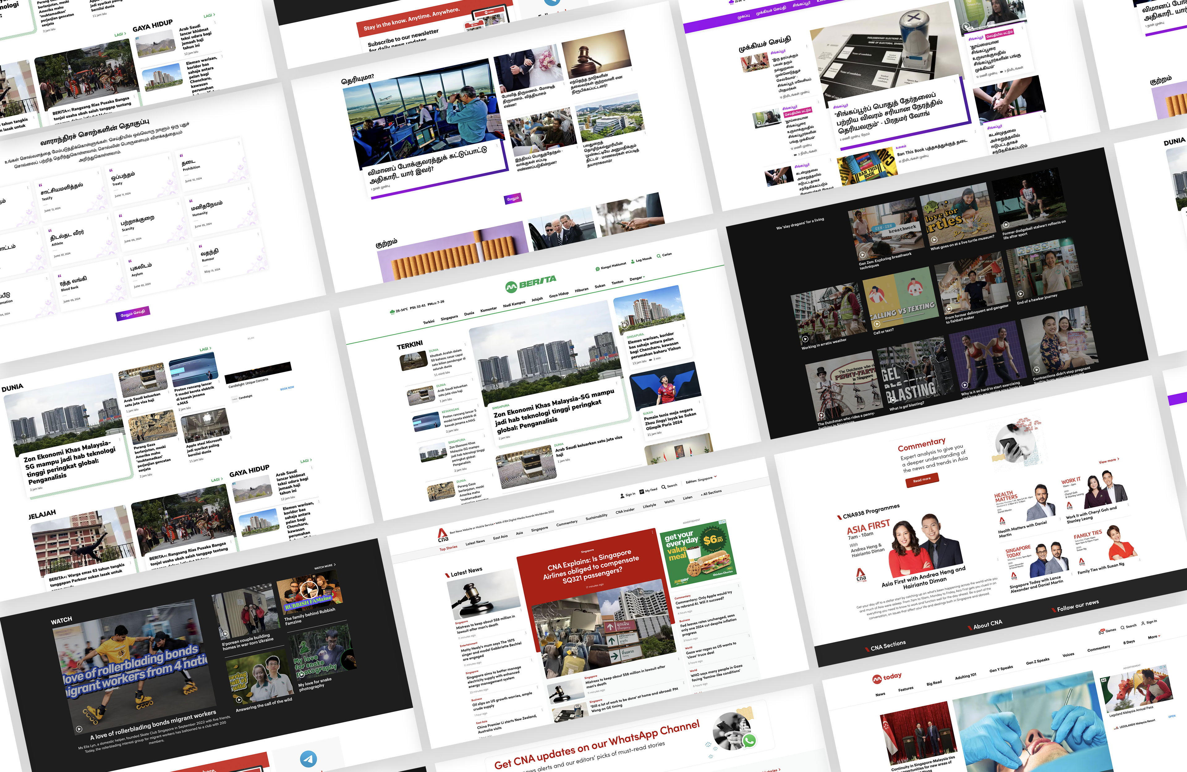
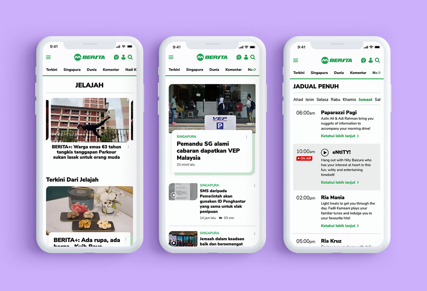
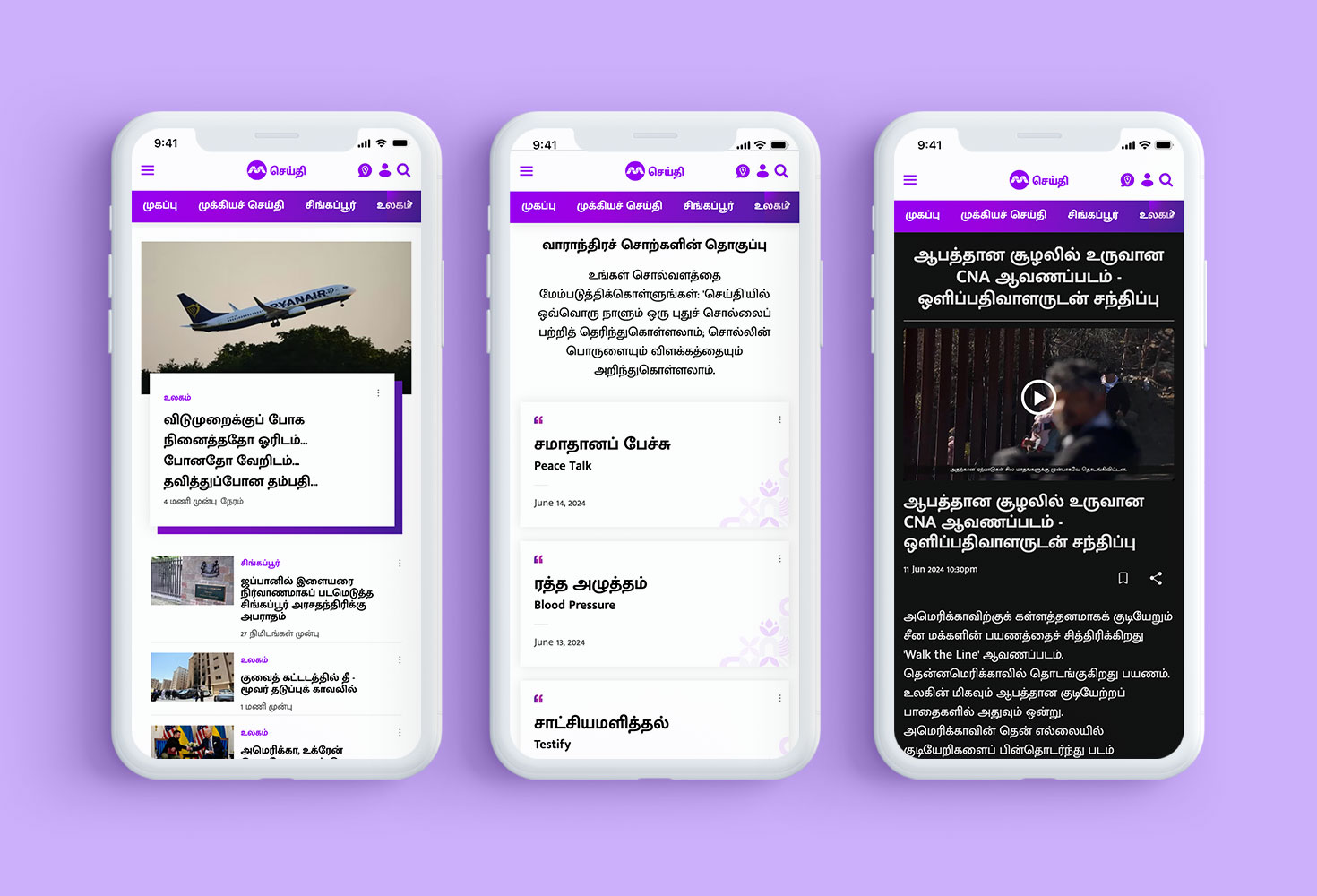
Understanding the diverse audience demographics and the distinct positioning of Channel NewsAsia (CNA), TODAY, Berita, and Seithi was paramount. Each platform had its own visual language tailored to resonate with its specific audience segment while aligning with Mediacorp's overarching brand identity.
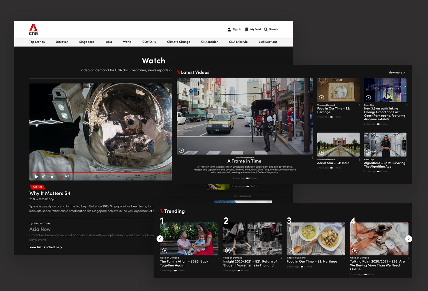
Channel NewsAsia (CNA) demanded a design language that reflected its global perspective and authoritative stance in delivering news. Sophistication, clarity, and credibility were key elements incorporated into the art direction to uphold CNA's esteemed reputation. Mood boards and style guides were meticulously crafted for each platform, outlining distinct visual elements such as color schemes, typography choices, and imagery. These guidelines ensured that while each platform retained its individual identity, there was a cohesive brand experience across all Mediacorp digital properties.
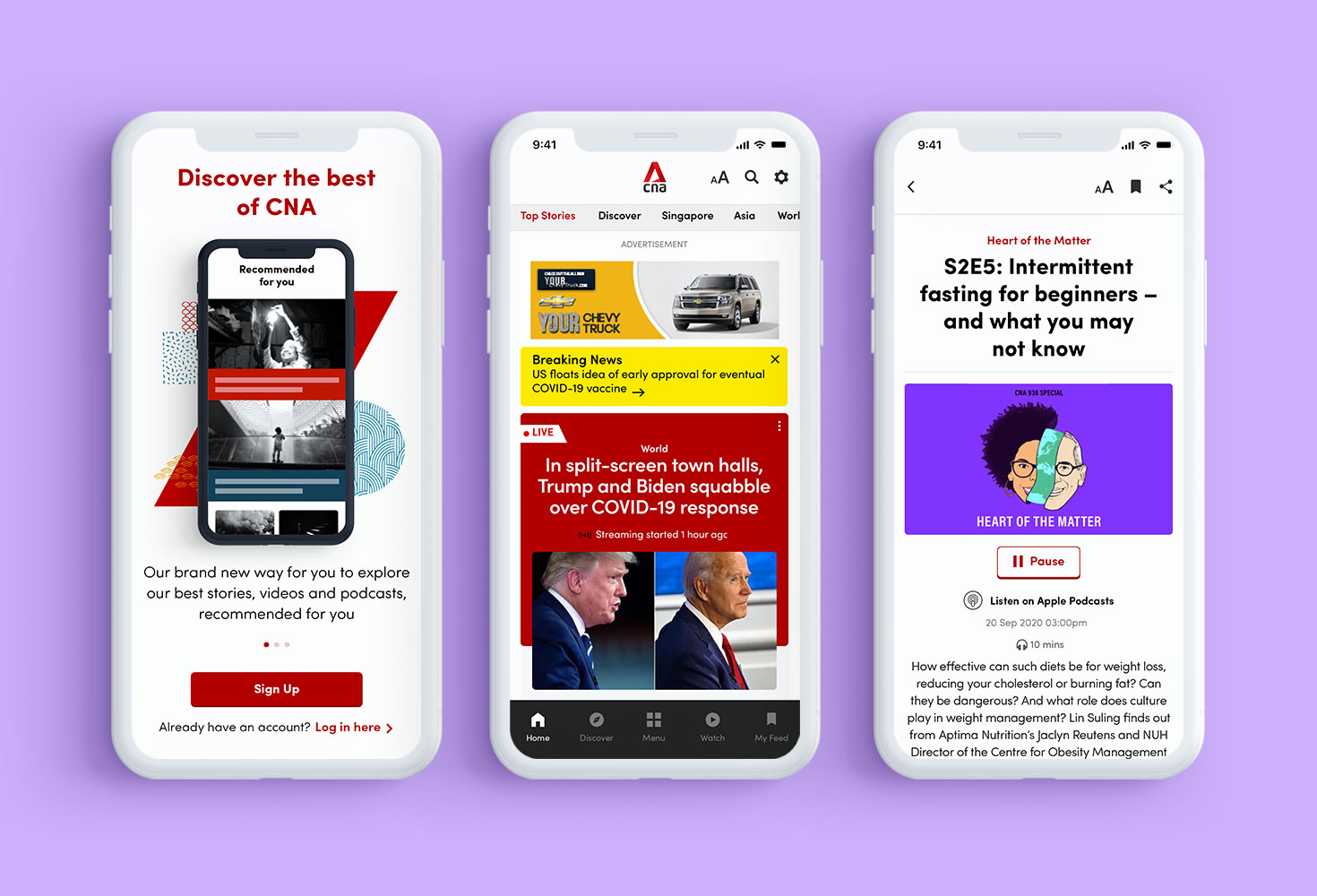
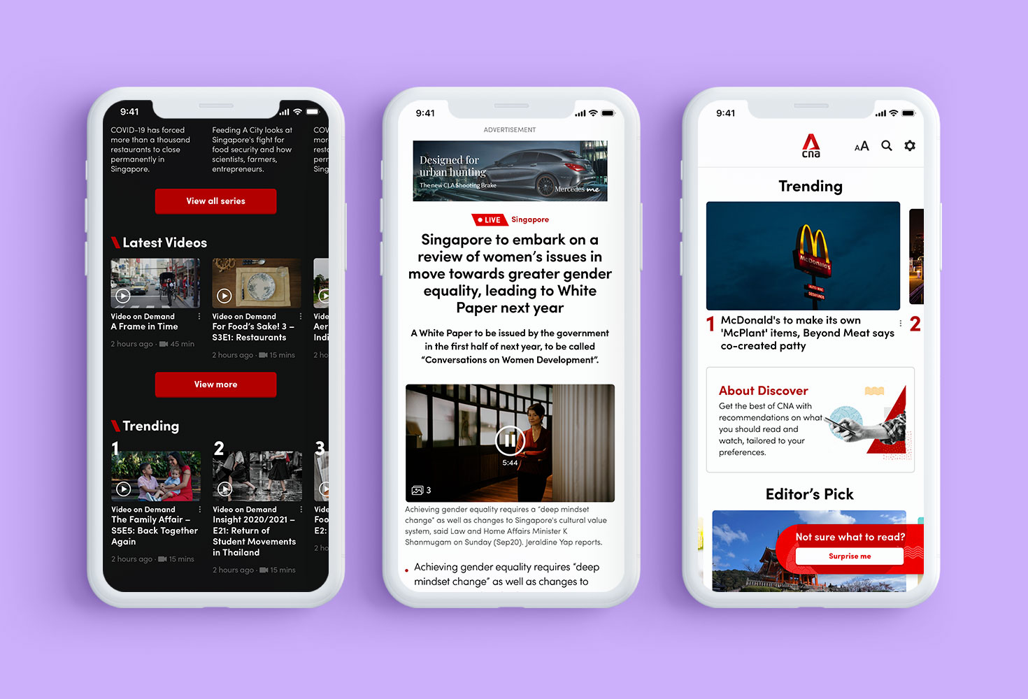
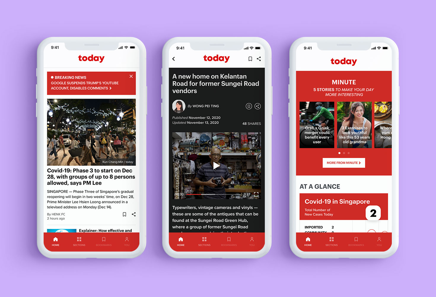
I designed a set of reusable components and templates, ensuring consistency and efficiency across the CMS. This modular design system provided flexibility and customization, allowing each channel to tailor its interface while maintaining a unified look and feel.
Focusing on usability and accessibility, we also conducted extensive user testing to refine the interfaces. This user-centric approach helped us create intuitive and engaging designs, enhancing the overall user experience. The result was a flexible and cohesive digital experience that effectively supported the diverse needs of each channel.
To ensure a seamless user experience across various devices, I designed UI components and templates that were fully responsive. This approach allowed the CMS to adapt fluidly to different screen sizes, from desktops to tablets and mobile phones. Additionally, designing for mobile apps required a focus on intuitive navigation and user-friendly interfaces, ensuring that users had an efficient and enjoyable experience regardless of the device they used.
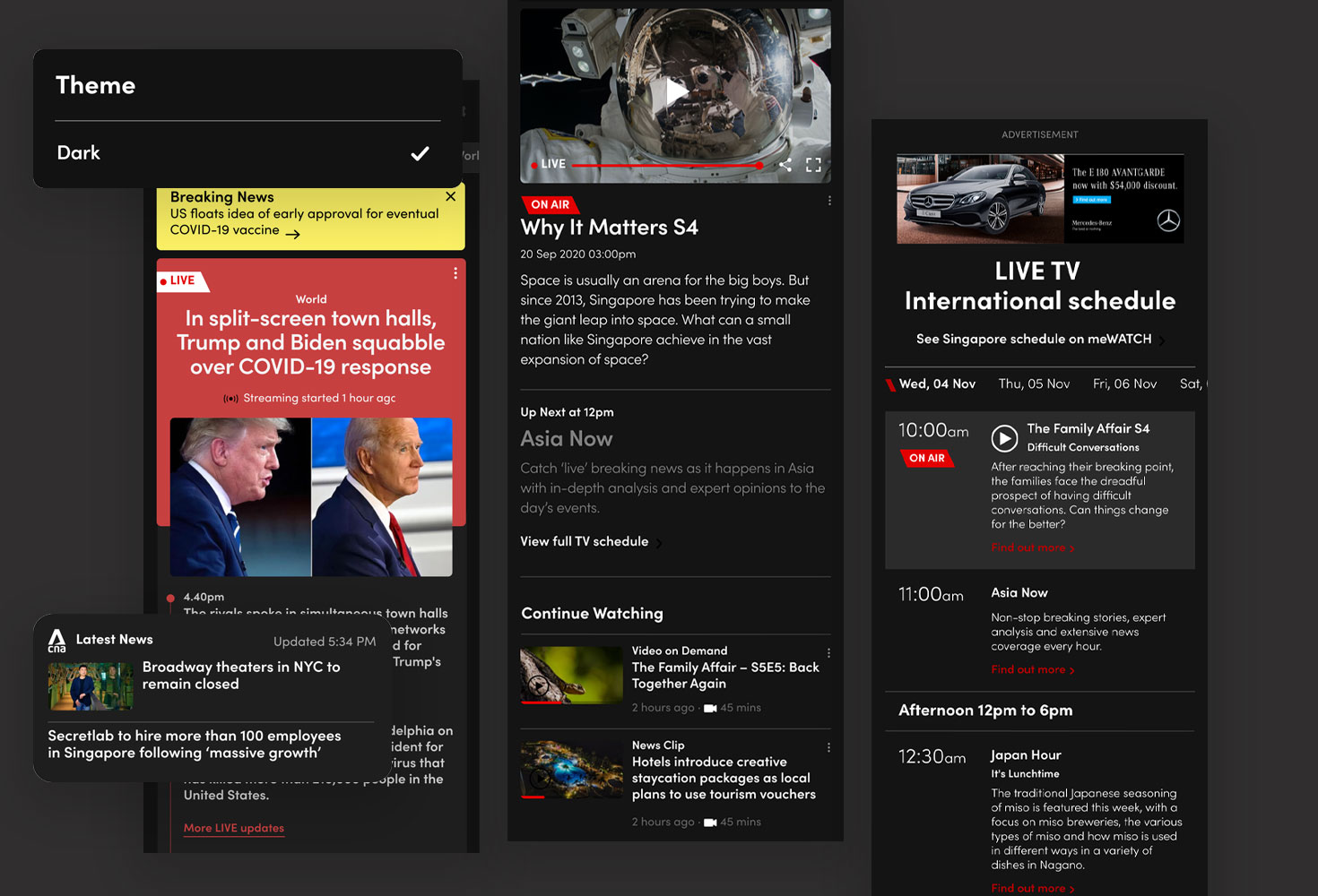
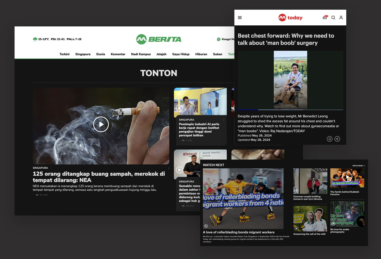
We implemented a dark mode option for users to toggle across all pages in the mobile app, considering readability and visual comfort in low-light environments. For watch pages especially, dark mode is enabled by default, taking a similar approach to popular streaming service Netflix so users are accustomed to this type of app. This feature enhanced the user experience during nighttime viewing and provided a sleek, modern aesthetic throughout the app.
To enhance user engagement, we integrated interactive elements such as entrance animations and smooth transitions. These elements added sophistication, guided user attention, and provided visual feedback, making the interface feel more lively and responsive. Smooth transitions created a seamless experience, allowing users to navigate content effortlessly and enjoyably.
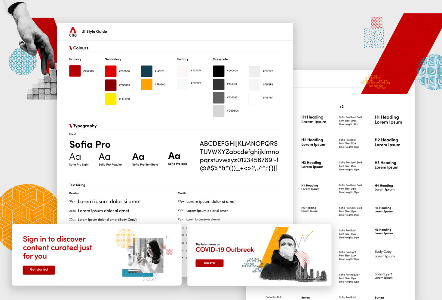
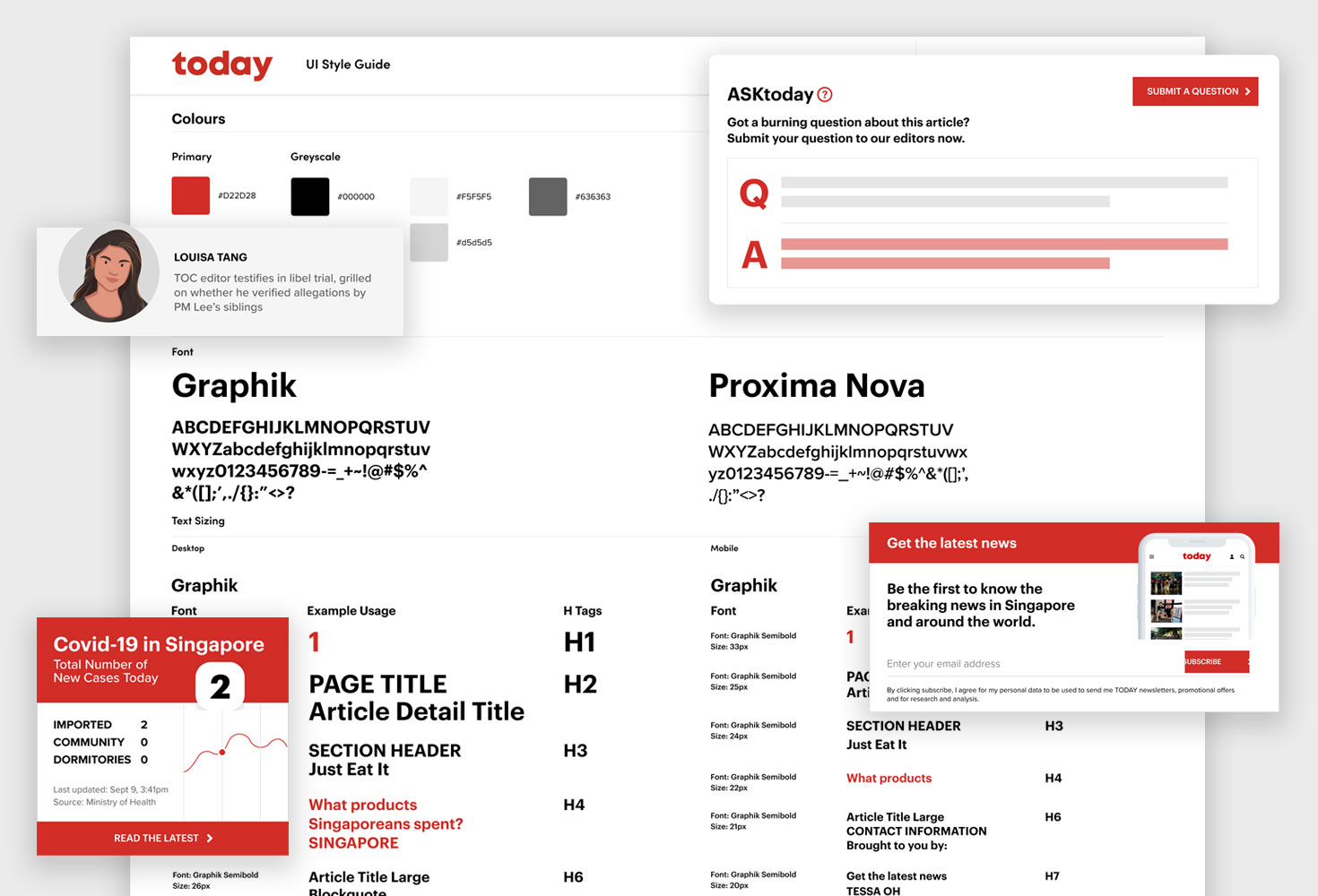
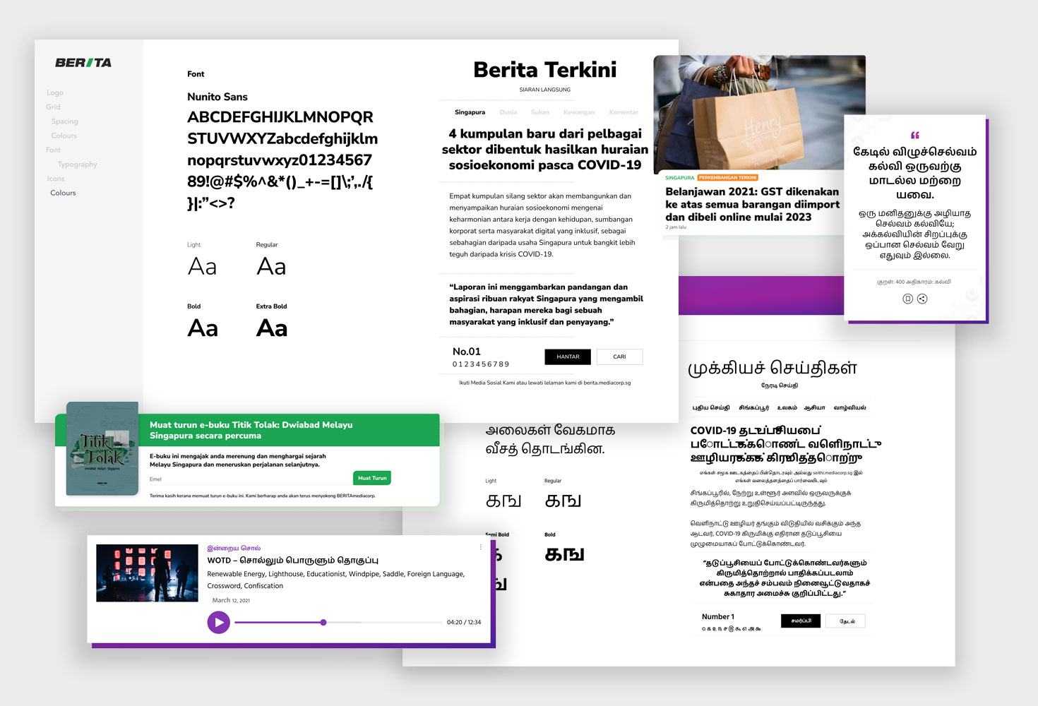
I developed a comprehensive design system that included a library of reusable components and templates, as well as graphic patterns used for banners, backgrounds, and other UI elements. These graphic patterns were designed to elevate the user experience by adding visual interest and breaking the monotony of text-heavy news articles. The combined design system ensured consistency and efficiency while allowing each channel to maintain its unique identity, making the content more engaging and enjoyable to consume.
By developing a modular design system and incorporating tailored visual elements for each channel, I ensured a consistent yet distinctive user experience. The integration of responsive design, dark mode, and engaging interaction elements significantly enhanced usability and user engagement.
This project demonstrated my ability to balance strategic thinking with creative execution, ultimately delivering a product that met both business goals and user needs, showcasing the power of thoughtful, user-centric design in transforming digital media consumption.
Introducing GCash Flashback, a dynamic feature designed to transform the financial journey of GCash users into an exciting visual story. Inspired by the popular "Spotify Wrapped," this project offers a personalised year-end review, showcasing spending habits, favourite app features, and financial milestones through vibrant animations and engaging graphical visualisations.
Discover MoreElevating the SME banking experience for Siam Commercial Bank through a comprehensive website revamp. Discover how we enhanced digital banking with improved usability, personalised solutions, and a seamless user journey. Click to learn how we've redefined online banking for SMEs.
Discover More


