One of the major hurdles was changing the perception of Wella among the younger generation. Traditionally, Wella has been seen as a brand for older demographics, and cream-based hair dyes are not typically the first choice for younger consumers. Our task was to modernise Wella’s image, making it relevant and appealing to a trend-conscious, younger audience who are interested in vibrant and fashionable hair colors. This required innovative design and marketing strategies to alter existing perceptions and attract a new customer base.
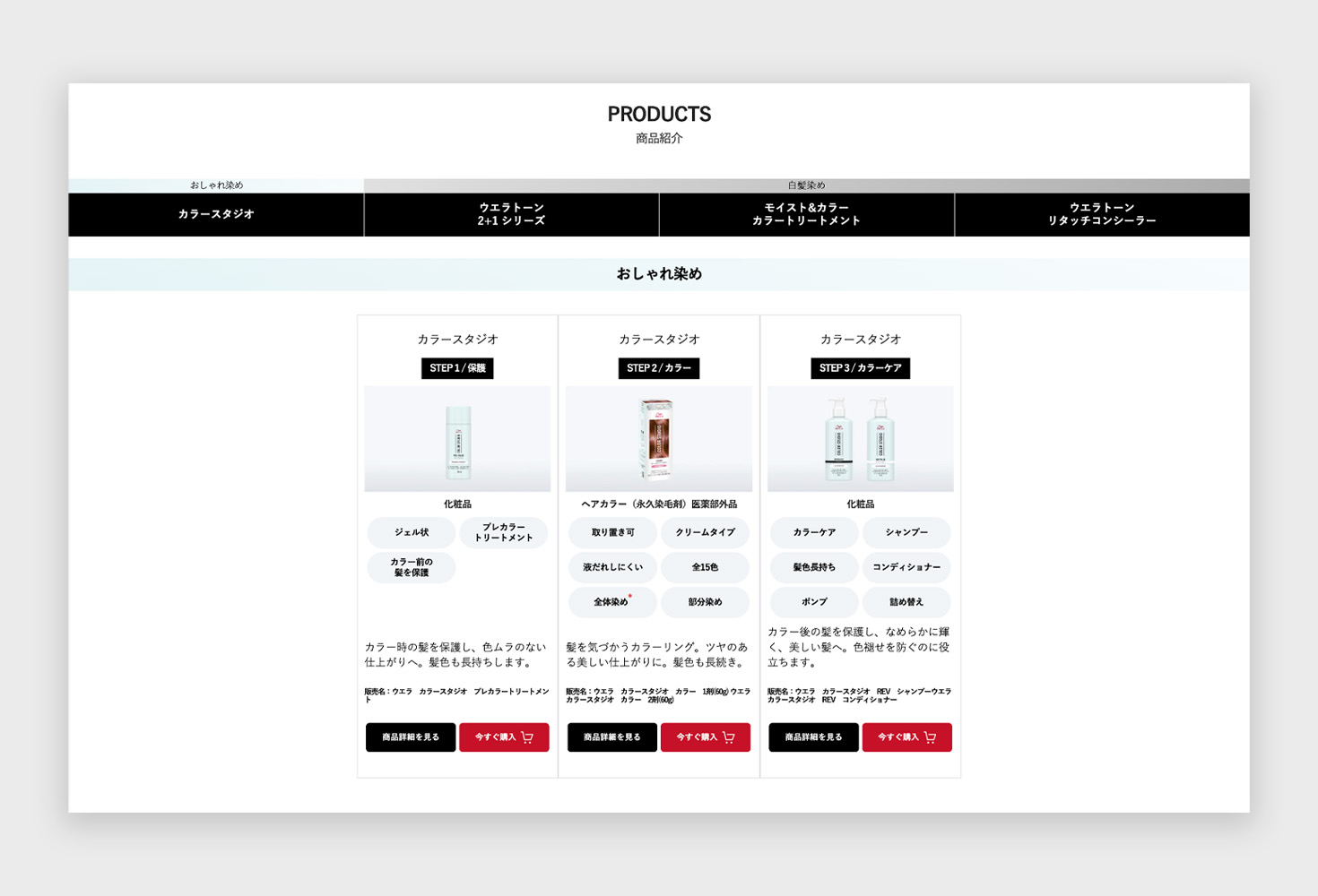
The new Color Studio product line involves a three-step process, which needed to be communicated clearly and effectively to users. Unlike single-step products, this multi-step process could be seen as complicated and daunting. The challenge was to simplify and demystify this process, making it accessible and straightforward for users. Our design needed to provide clear, engaging instructions and visuals to guide users through each step, ensuring they understood how to use the products correctly and appreciated their benefits.
Another significant challenge was integrating the new microsite seamlessly with Wella's existing website. The goal was to incorporate the new features without major modifications to the current site infrastructure, ensuring a consistent and smooth user experience. This required meticulous planning and design to maintain the brand’s visual and functional coherence while introducing the new Color Studio elements. The microsite had to align with Wella’s existing design language and technical framework, providing an enhanced user experience without disrupting the established website structure.
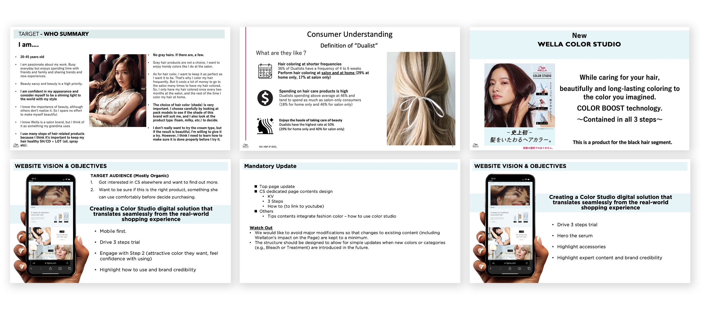
Analysing the provided personas and their sentiments, I identified that younger users are conscious of beauty and prefer trendy colors. They perceive grey hair as undesirable and might be put off by the cream-based dye if not properly educated on its benefits.
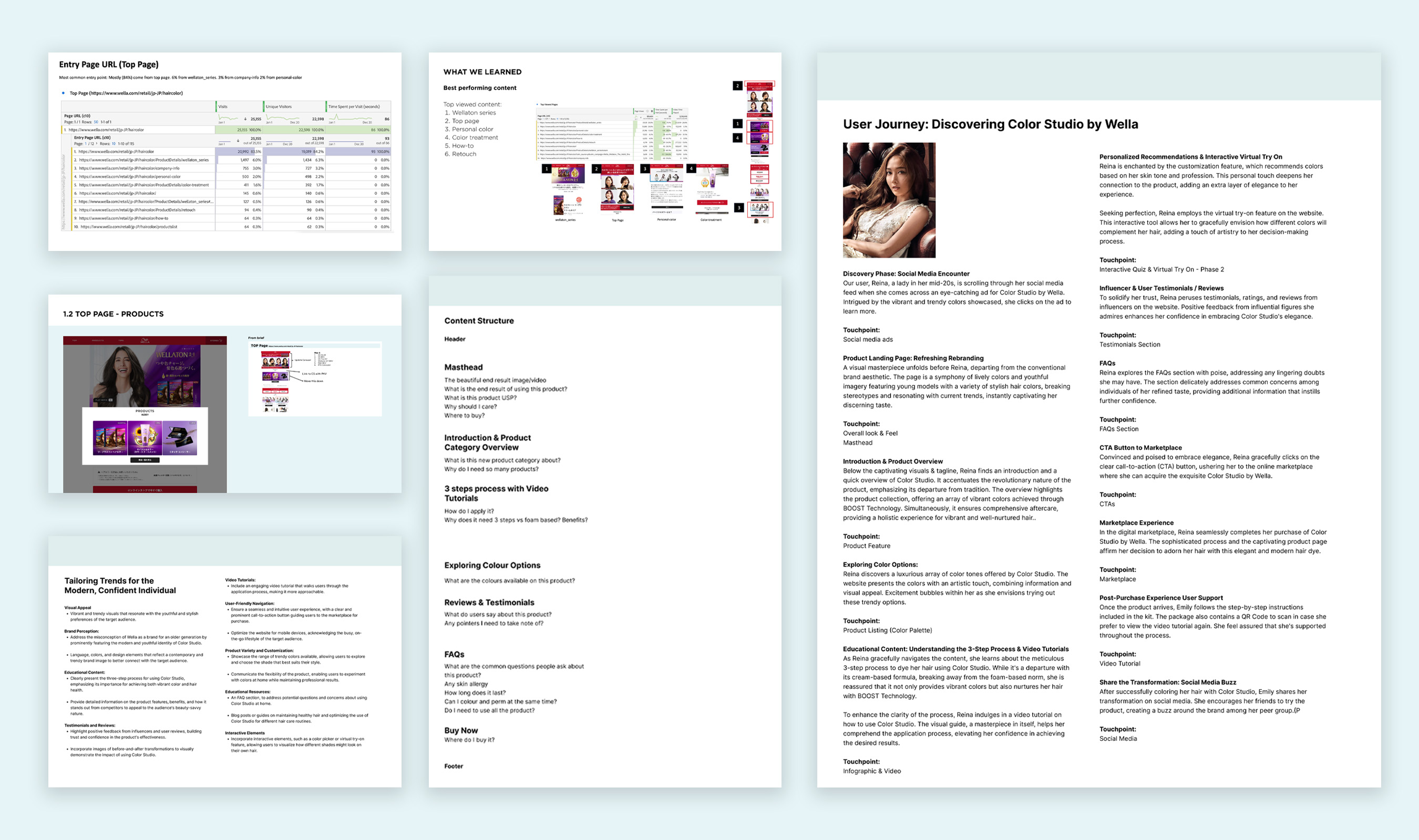
Using tools like Google Analytics, I analysed the performance of Wella’s current retail site to identify top-performing pages, content that drives engagement, and user entry points. This data provided insights into areas where we can introduce entry points to the new microsite.
I mapped out a detailed user journey for visitors to the new Color Studio microsite. This journey included various touchpoints and interactions designed to engage users, provide valuable information, and guide them seamlessly through the process of selecting and using Wella’s products.
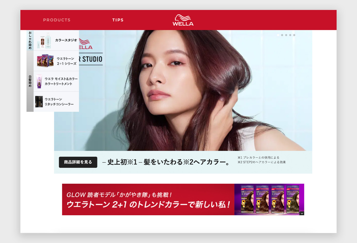
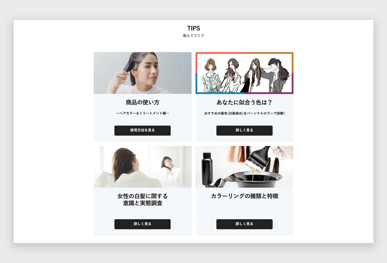
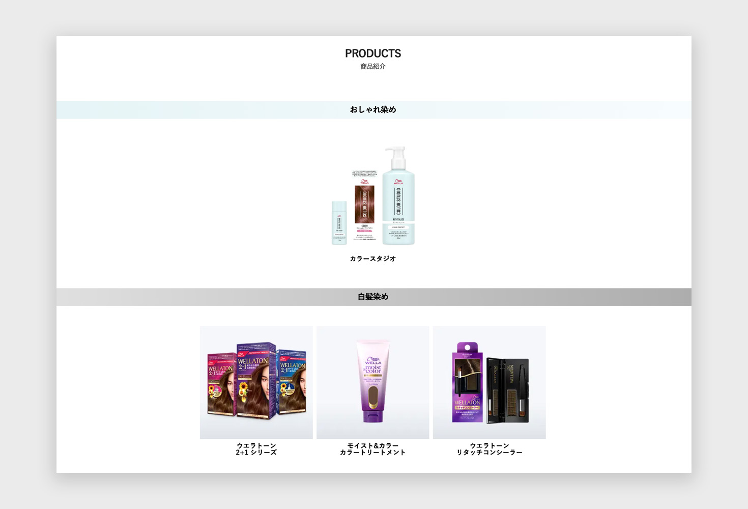
The homepage featured an engaging introduction video masthead, which used snippets from the Color Studio campaign video to captivate users’ attention and provide a glimpse of the new product series. It also prominently displayed the three-step process with clear calls-to-action, a color swatch section for users to preview available colors, and a "How to Use" section with an instructional video.
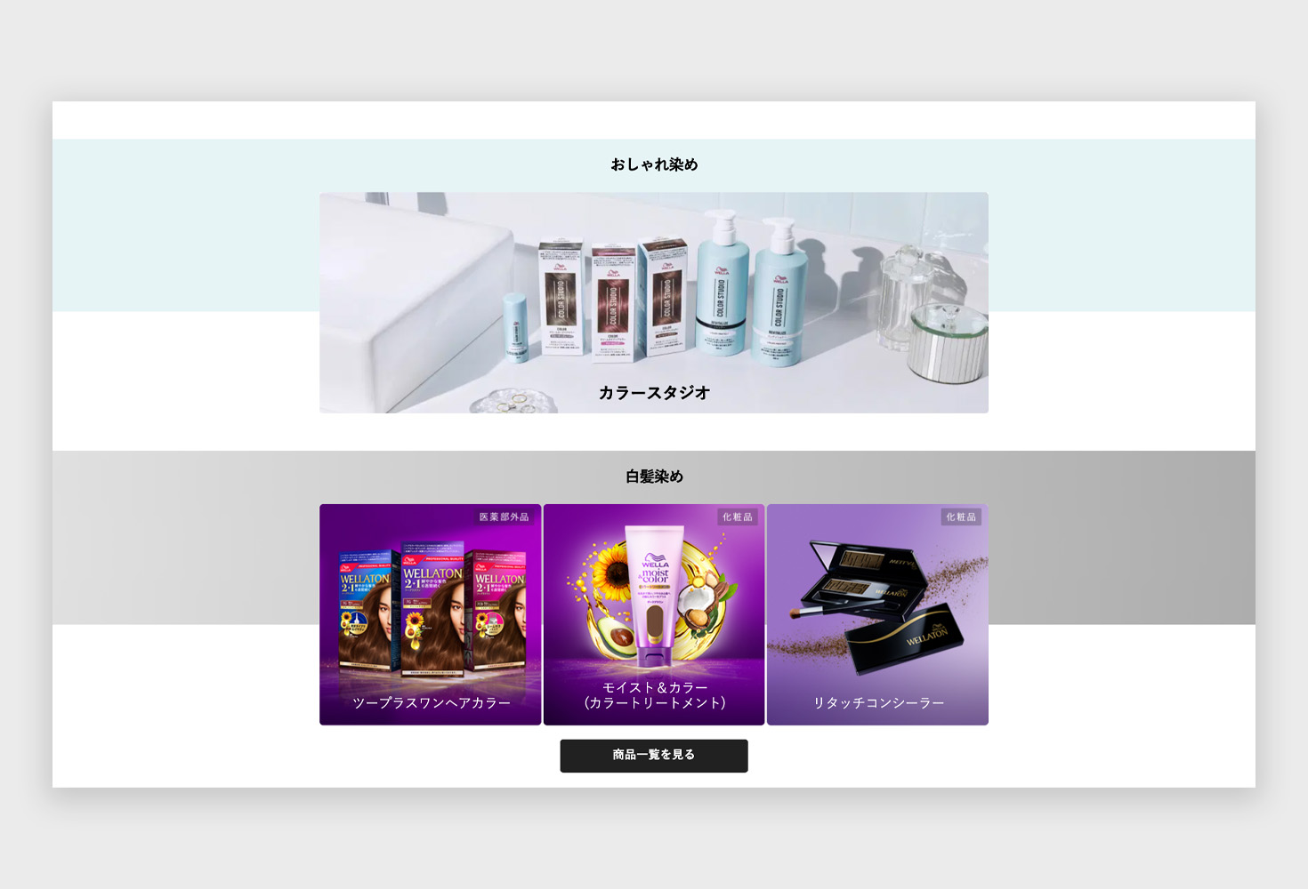
Each step in the Color Studio process had its own detailed page. These pages included a gallery of products relevant to the specific step, comprehensive usage instructions, and visual aids to simplify the process. This ensured users had all the information they needed at each stage, making the multi-step process intuitive and user-friendly.
Recognising the importance of strategic entry points, I identified key pages on the existing site where the new Color Studio products could be introduced. This approach ensured that users would naturally encounter the new offerings during their browsing experience, increasing visibility and engagement without requiring major modifications to the existing site structure.
The detailed user journey and clear content structure helped educate users on the benefits of the new products and how to use them.
By understanding the target audience and integrating strategic insights, the site effectively communicated the brand's message and engaged users through an intuitive and visually appealing design. The project highlighted the importance of combining aesthetics with functionality, resulting in a seamless and enjoyable user experience.
Introducing GCash Flashback, a dynamic feature designed to transform the financial journey of GCash users into an exciting visual story. Inspired by the popular "Spotify Wrapped," this project offers a personalised year-end review, showcasing spending habits, favourite app features, and financial milestones through vibrant animations and engaging graphical visualisations.
Discover MoreElevating the SME banking experience for Siam Commercial Bank through a comprehensive website revamp. Discover how we enhanced digital banking with improved usability, personalised solutions, and a seamless user journey. Click to learn how we've redefined online banking for SMEs.
Discover More


